A little piece of Kurdistan, online.
This is Kurdistan Souvenirs is a small e-commerce website featuring gifts inspired by Kurdish culture. I designed a welcoming storefront where people can explore the collection, discover the brand, and add their favourite pieces to their cart.
Role
UIUX Designer
timeline
3 weeks
Product type
E-Commerce
Language
English
Color Palette
A calmer space for colorful products.
I developed a softer palette from the brand’s original colours to give the website a calm, welcoming feel. Light backgrounds let the products stand out, while darker tones bring clarity to text and buttons. Colourful accents keep the brand’s personality present throughout.
Background
Background
- HEX
- #ffffff
- RGB
- 255,255,255
Black Olive
Texts & buttons
- HEX
- #3a443b
- RGB
- 58,68,59
Yellow
- HEX
- #fff1d1
- RGB
- 255,241,209
Purple
- HEX
- #e0dbfd
- RGB
- 224,219,253
Green
- HEX
- #c8e6a3
- RGB
- 200,230,163
Home Page
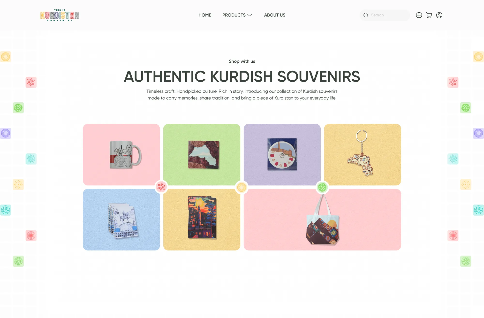
A colourful introduction to the collection.
The homepage opens with a playful arrangement of souvenirs, giving visitors an immediate feel for the brand. Featured products lead into the story behind the store, its connection to Visit Kurdistan, and a showcase of gift collections.
Product Discovery
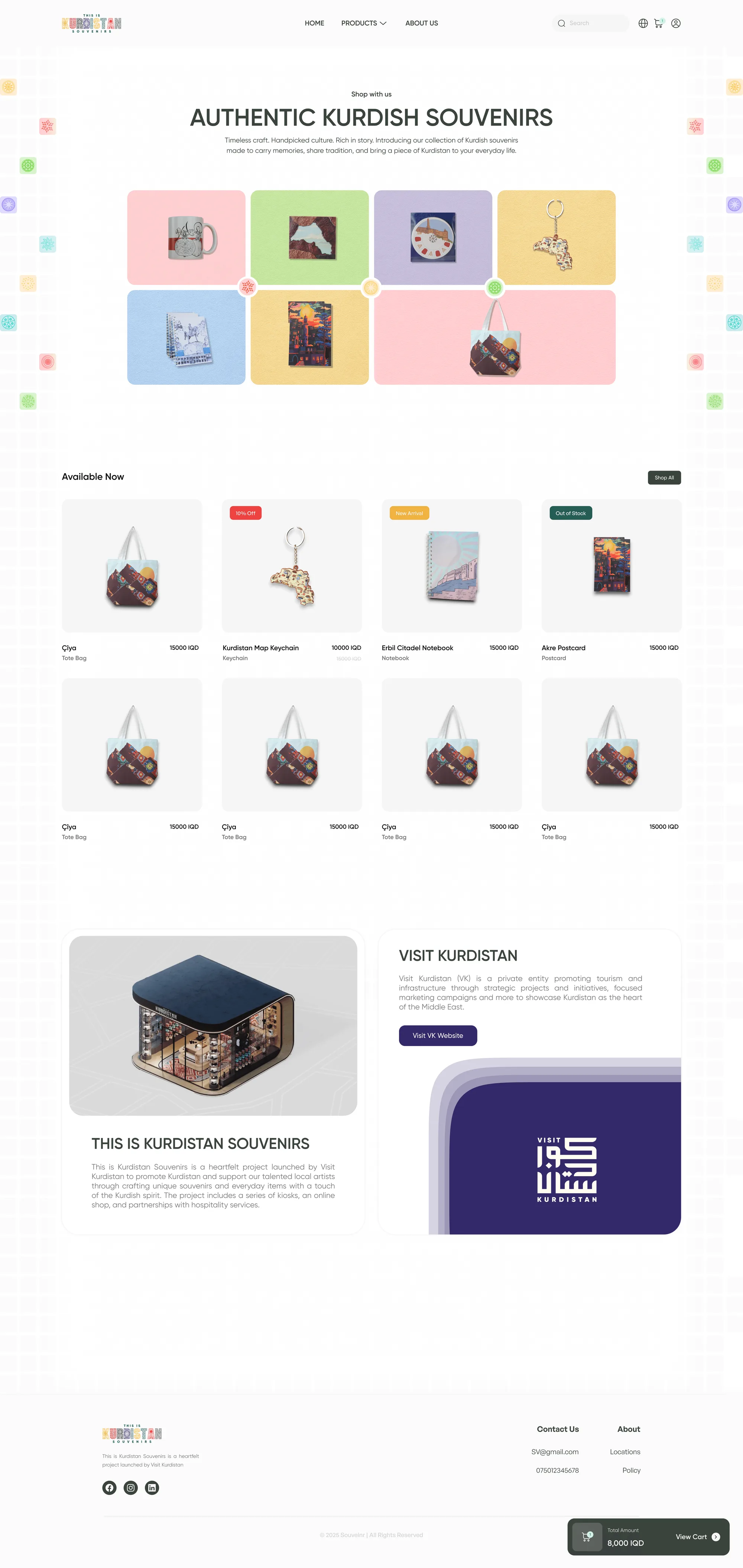
Letting the products do the talking.
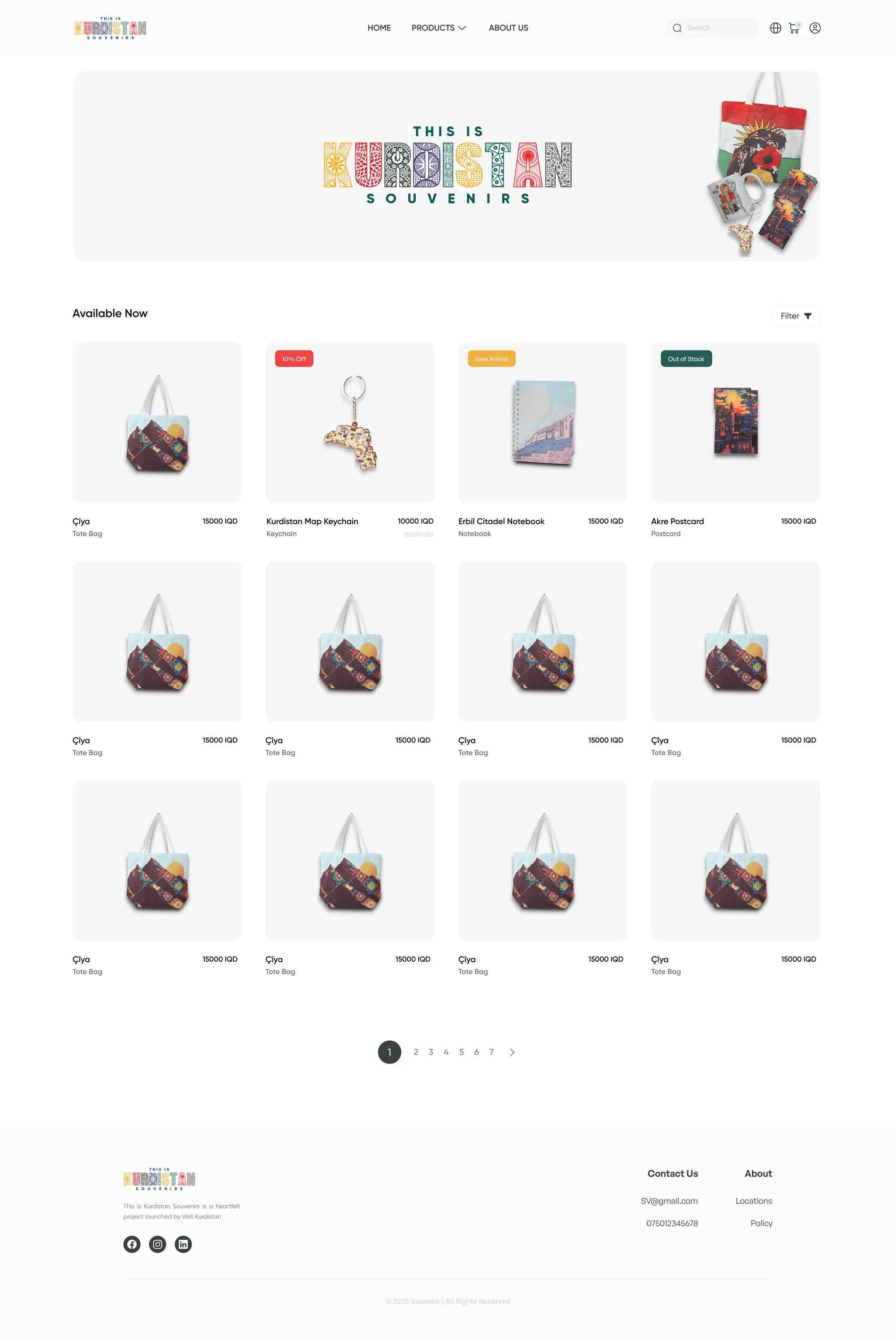
A consistent grid keeps product images, names, and prices easy to scan. Labels highlight discounts, new arrivals, and unavailable items, while search, filtering, and pagination provide ways to explore the collection.
Product Details
A closer look, without leaving the page.
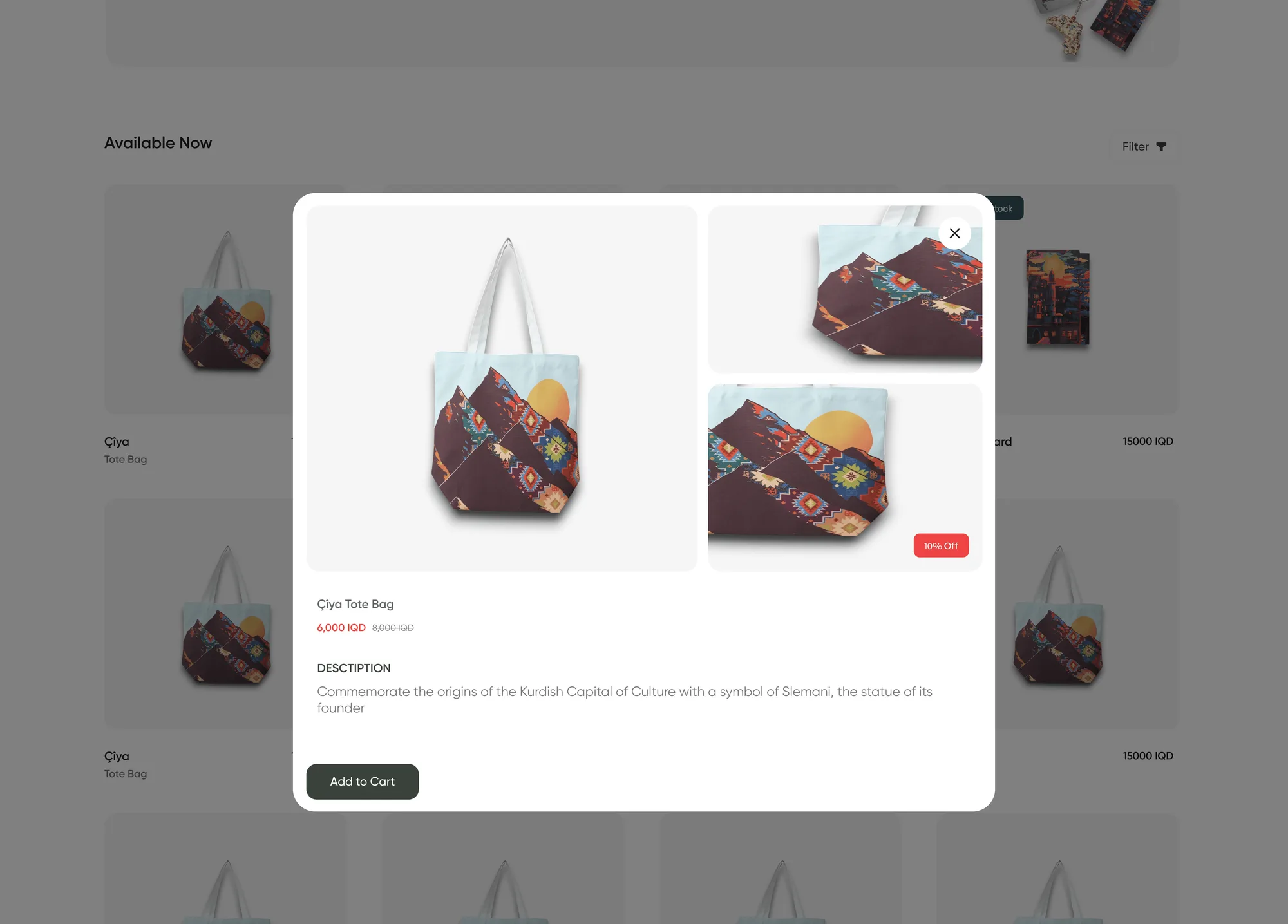
A quick-view window brings together product images, pricing, and a short description. Shoppers can inspect an item and add it to their cart while keeping their place in the collection.
Shopping Cart
Keeping the next step close.
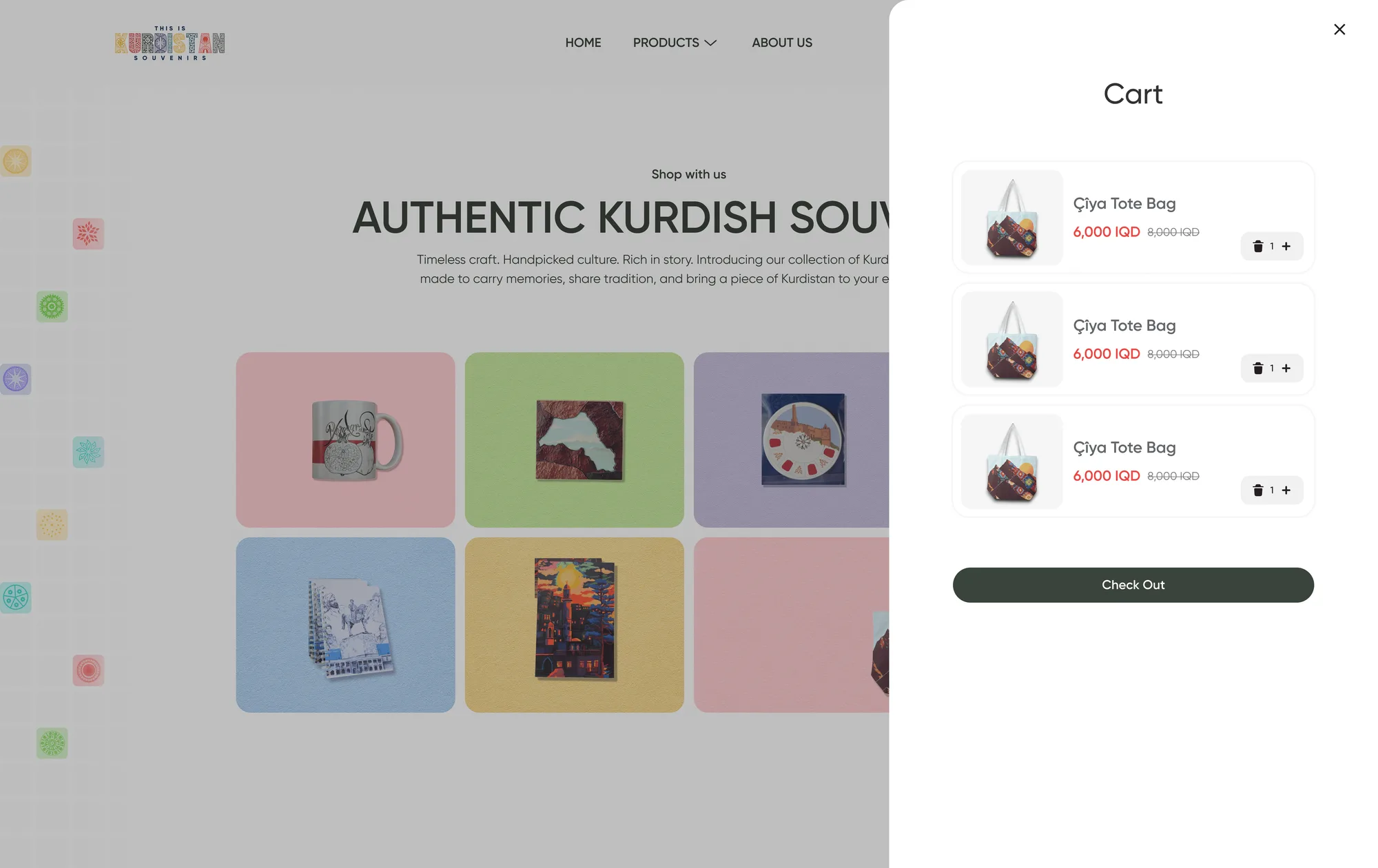
A compact cart lets shoppers review their items and adjust quantities before continuing to checkout. The floating cart summary keeps the total and a direct route back to the cart within reach as they browse.
Checkout Pages
A clear path to placing an order.
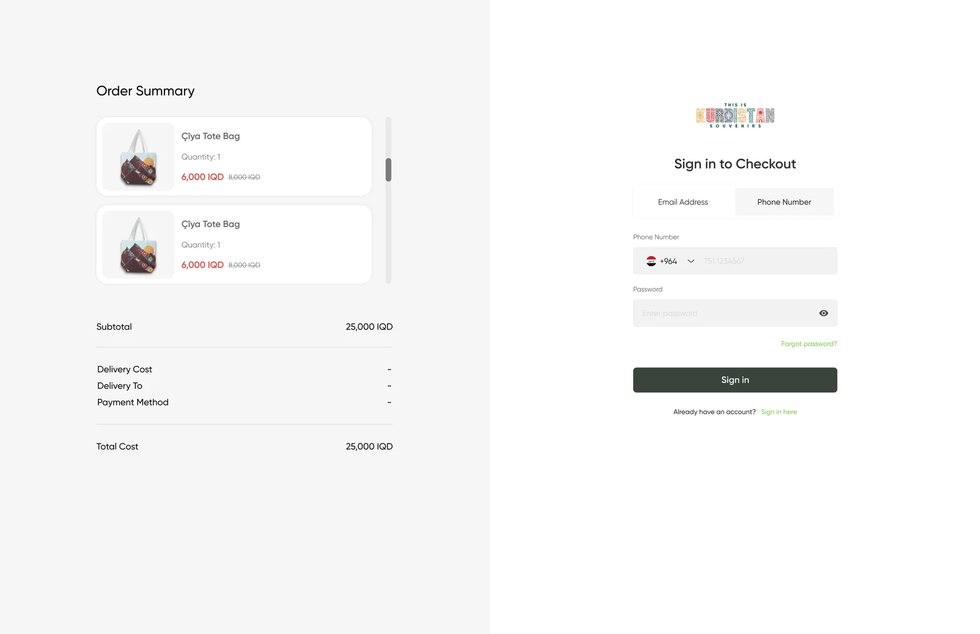
I divided checkout into simple steps for address details and payment, with a progress indicator to guide shoppers. The order summary stays visible throughout, keeping items, delivery fees, and the total easy to review before confirming the purchase.
01 — 07
Swipe or use the arrowsDrag or use arrows to navigate
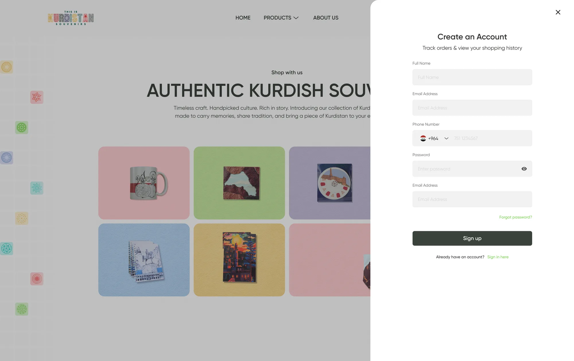
Customer Account
The essentials, in one place.
The account area brings together personal details, saved address information, and order history. Simple panels let customers update their information and look back at previous purchases without navigating a complicated dashboard.
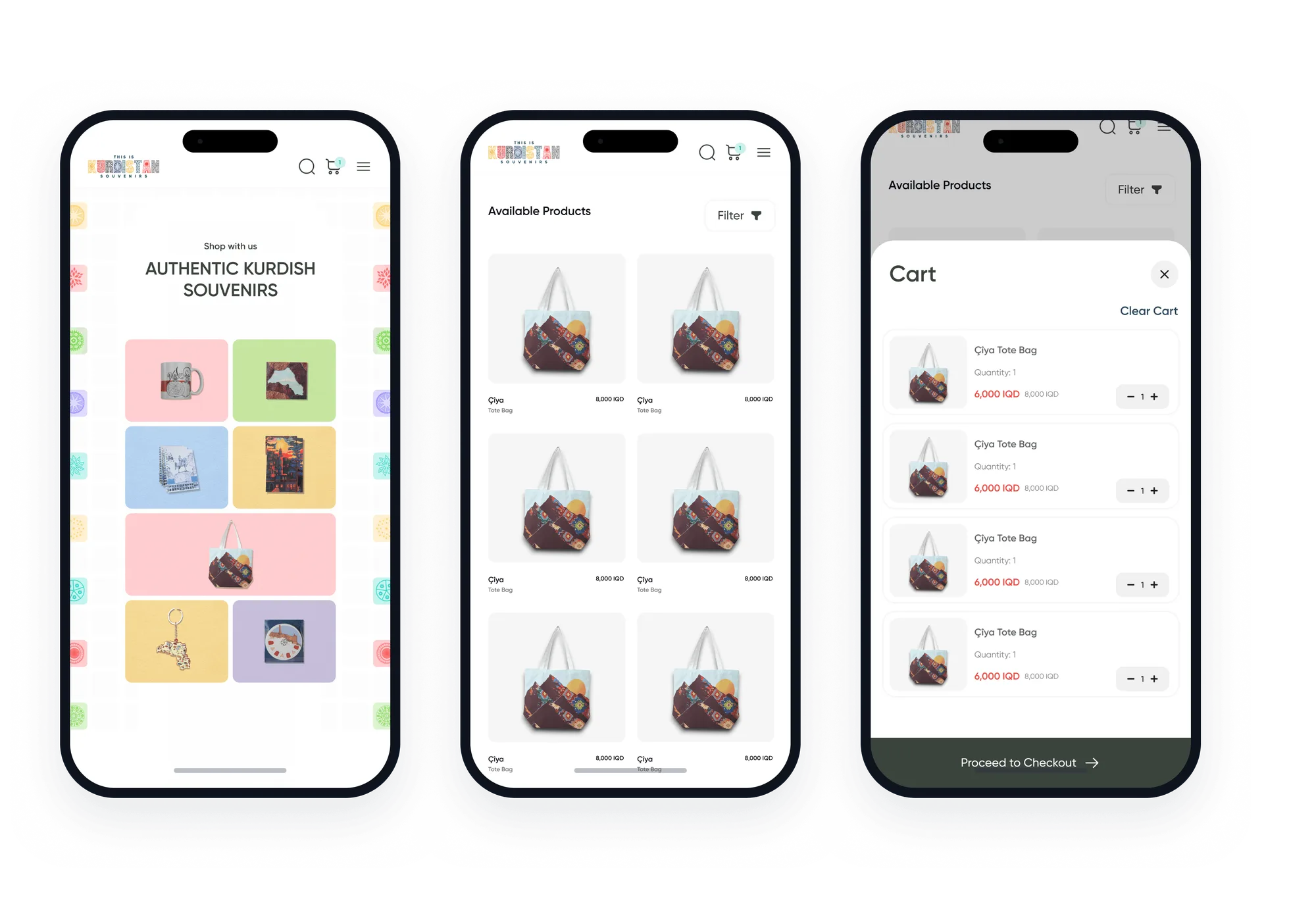
Mobile Experience
A little Kurdistan, on the go.
I adapted the shopping experience for smaller screens, keeping products easy to browse and key actions within reach. The mobile design carries the same colours and personality through a compact layout, from exploring the collection to placing an order.
Design Reflection
Small store, clear identity.
This project brought together cultural expression and everyday usability. Colour and imagery give the store its character, while a consistent layout keeps the focus on the products and the steps needed to shop.
Function first.Beauty always.