Bringing Kurdistan’s places, culture, and experiences closer to travellers.
Visit Kurdistan is a tourism website that introduces visitors to the region and helps them explore what it has to offer. It brings destinations, local experiences, events, tour packages, and practical travel information together in one place.
My focus was to create a welcoming digital experience that reflects the brand and gives visitors a clear starting point for discovering Kurdistan.
Role
UIUX Designer
Timeline
2 Months
project type
Web . Responsive
Language
English, Kurdish, Arabic
Color Palette
Yellow as a touch of the brand
I highlighted yellow throughout the interface to bring a recognizable touch of the brand into the browsing experience.
Main Purple
Primary Color
- HEX
- #36196d
- RGB
- 54,25,109
Ivory Cream
Primary Color
- HEX
- #fffdeb
- RGB
- 255,253,235
Teal Green
Brand Color
- HEX
- #005e53
- RGB
- 0,94,83
Charcoal Olive
Brand Color
- HEX
- #5c5c5c
- RGB
- 92,92,92
Lime Pastel
Brand Color
- HEX
- #edff81
- RGB
- 237,255,129
Home Page
A first impression of Kurdistan
I wanted the website to feel open, inviting, and easy to explore. Large photography puts the region’s landscapes, cities, and culture at the centre of the experience. Clear headings, rounded cards, and generous spacing help visitors browse the content without feeling overwhelmed.

Tour Packages
From inspiration to exploration
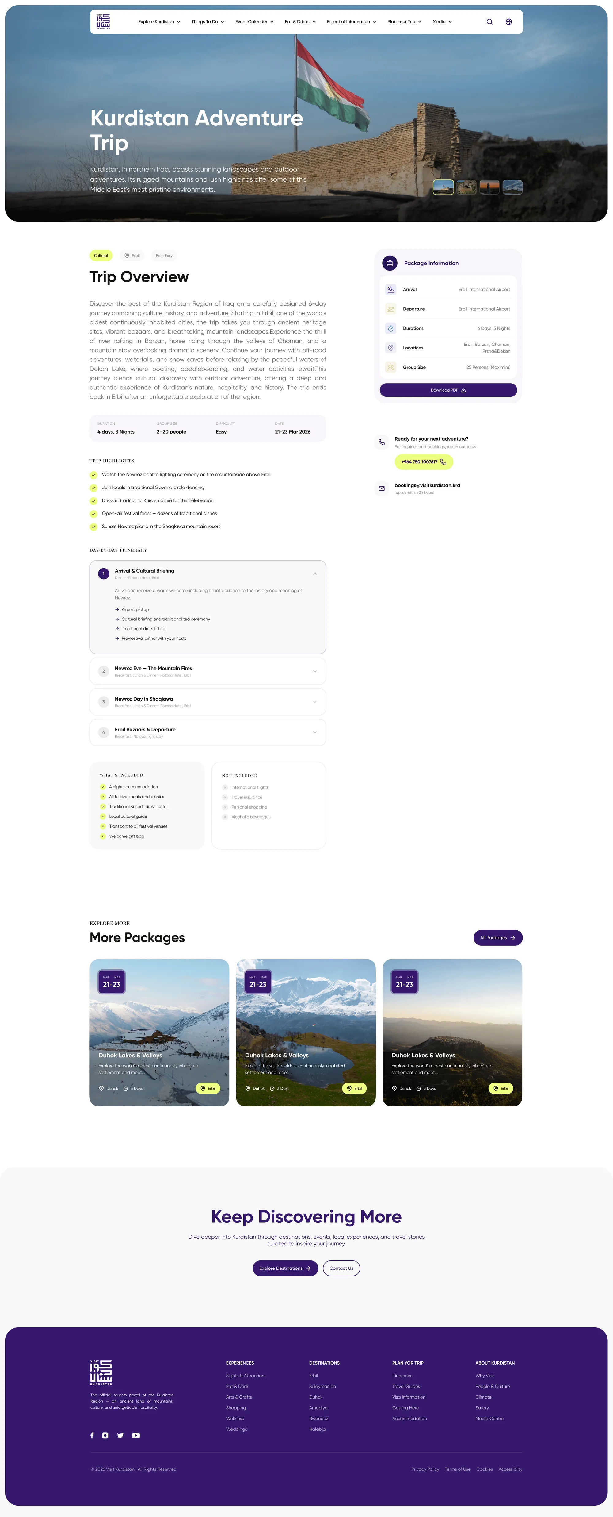
The packages section brings organised trips into view, with titles, dates, and short descriptions that visitors can scan quickly. It connects the inspiration of browsing with more concrete travel options.
Featured Destinations
Discover the region
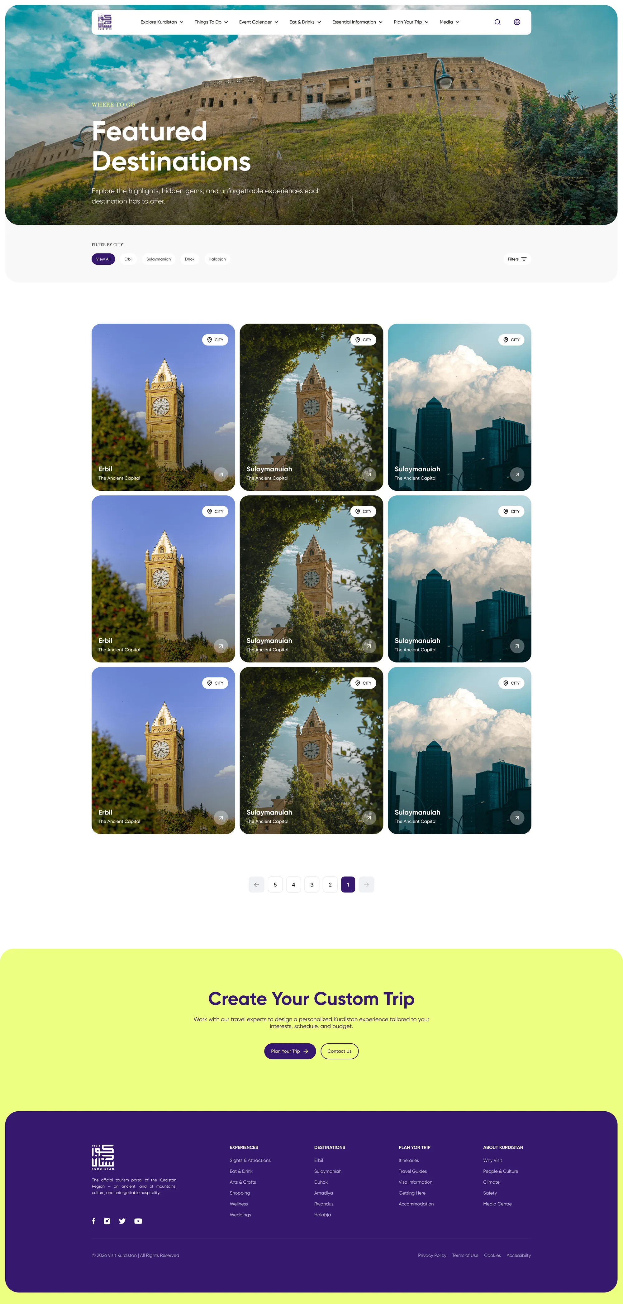
This section introduces Erbil, Duhok, Sulaymaniyah, and Halabja through image-led cards. Each card combines photography with a short description, giving visitors a glimpse of the city before they explore further.
What Will You Discover?
Explore by interest
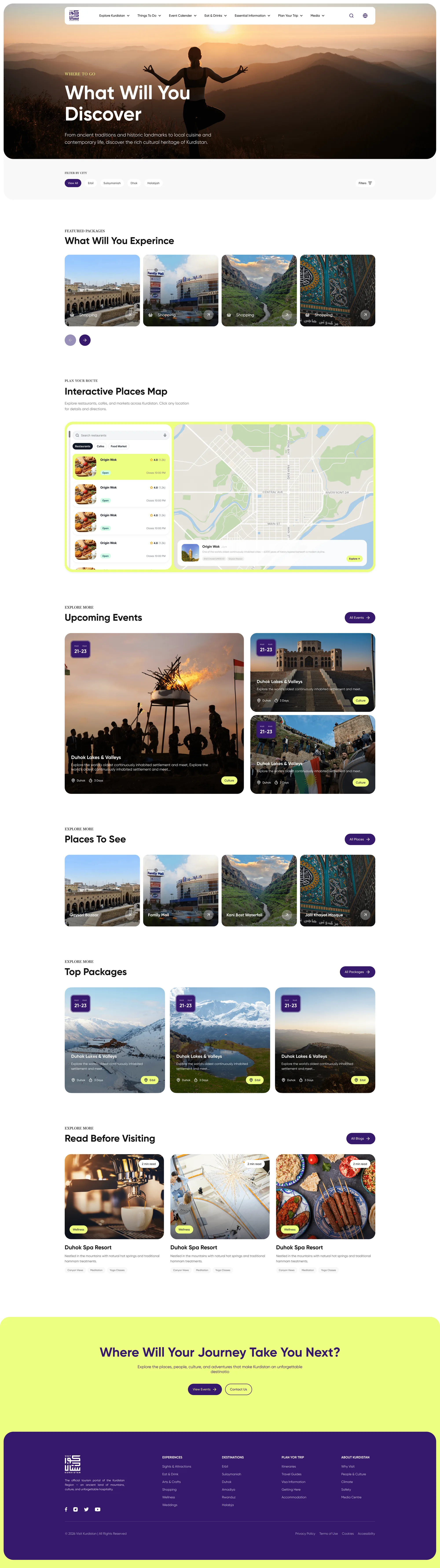
"What Will You Discover?” lets visitors browse according to their interests, including food, shopping, wellness, arts and crafts, and attractions. The varied card layout adds visual rhythm while keeping each category easy to recognize.
Upcoming Events
What's happening
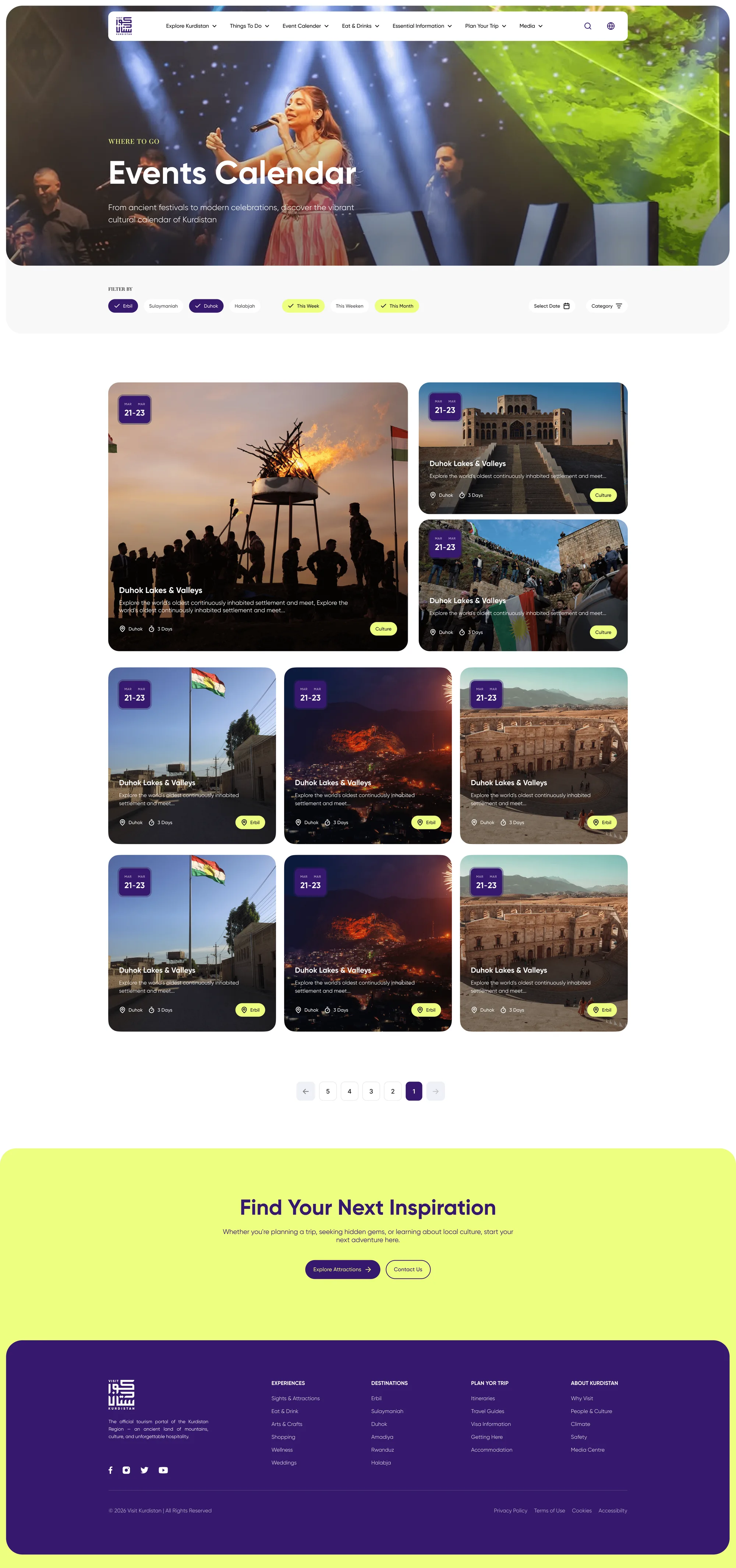
The events section highlights what is happening across Kurdistan. Visible dates and filters for this week or this month help visitors find events relevant to their visit.
Know Before You Go
The travel essentials
Practical information sits alongside the more visual content. This section provides clear entry points to information about Kurdistan, visa regulations, travel guidance, and getting around.
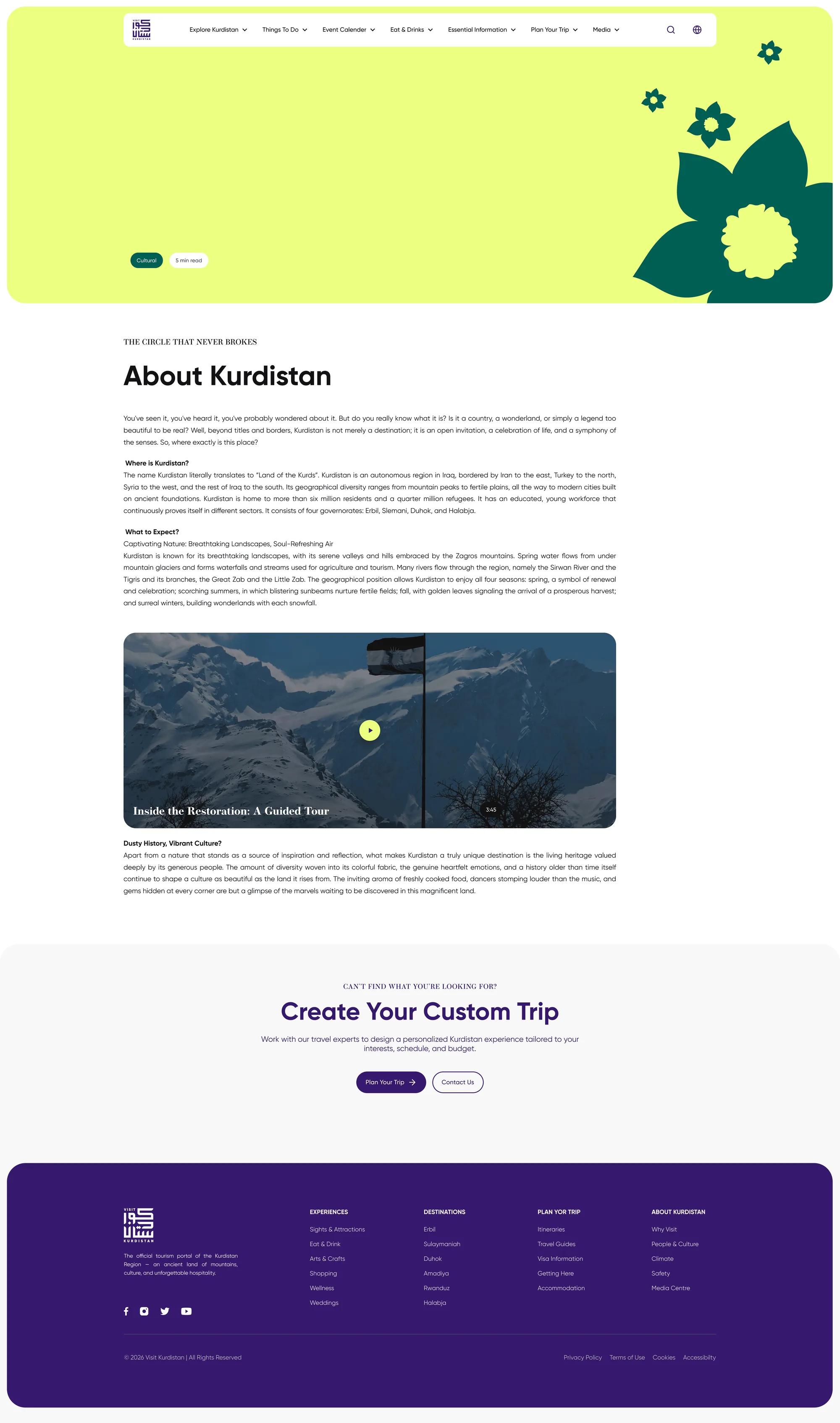
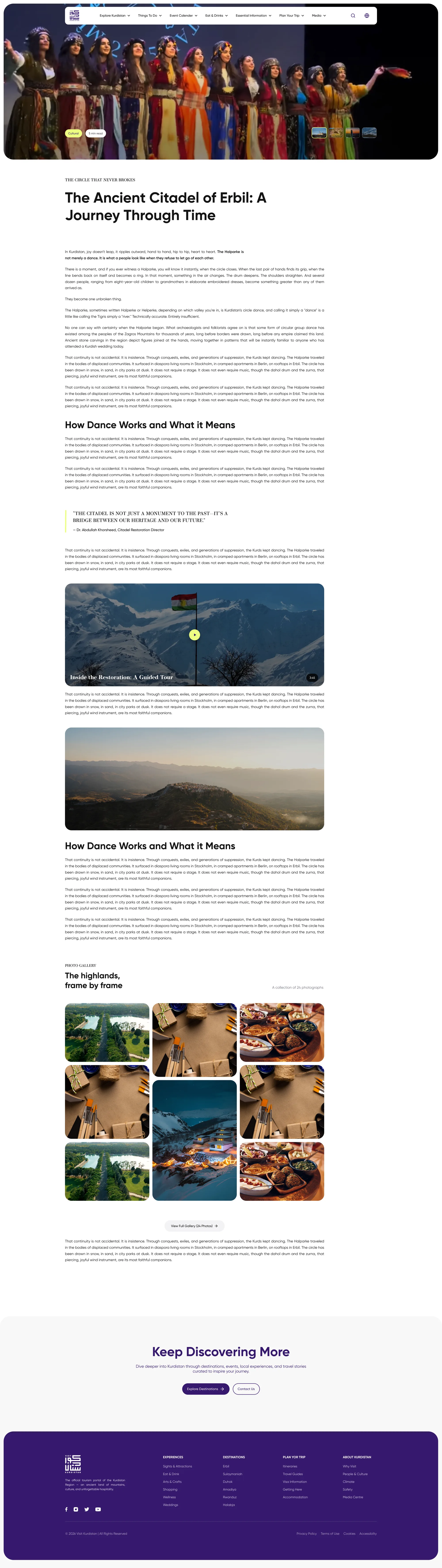
Stories and Guides
Beyond the destination
I designed a flexible article page with components for different types of content, giving project managers the freedom to choose how they present information in each article.
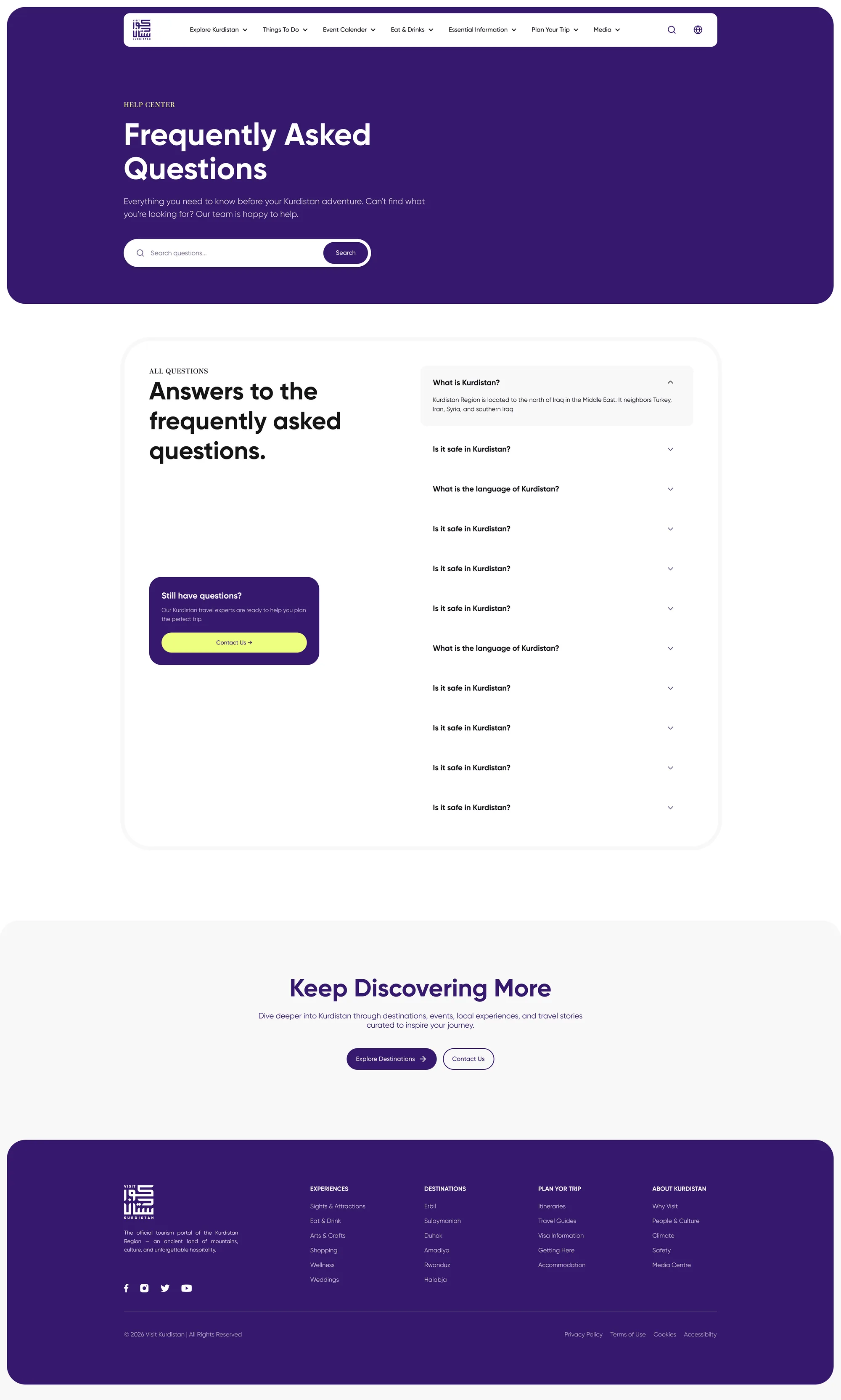
FAQs Page
The common questions
I designed the FAQ section with expandable answers, helping visitors find the information they need while keeping the page clean and easy to scan.
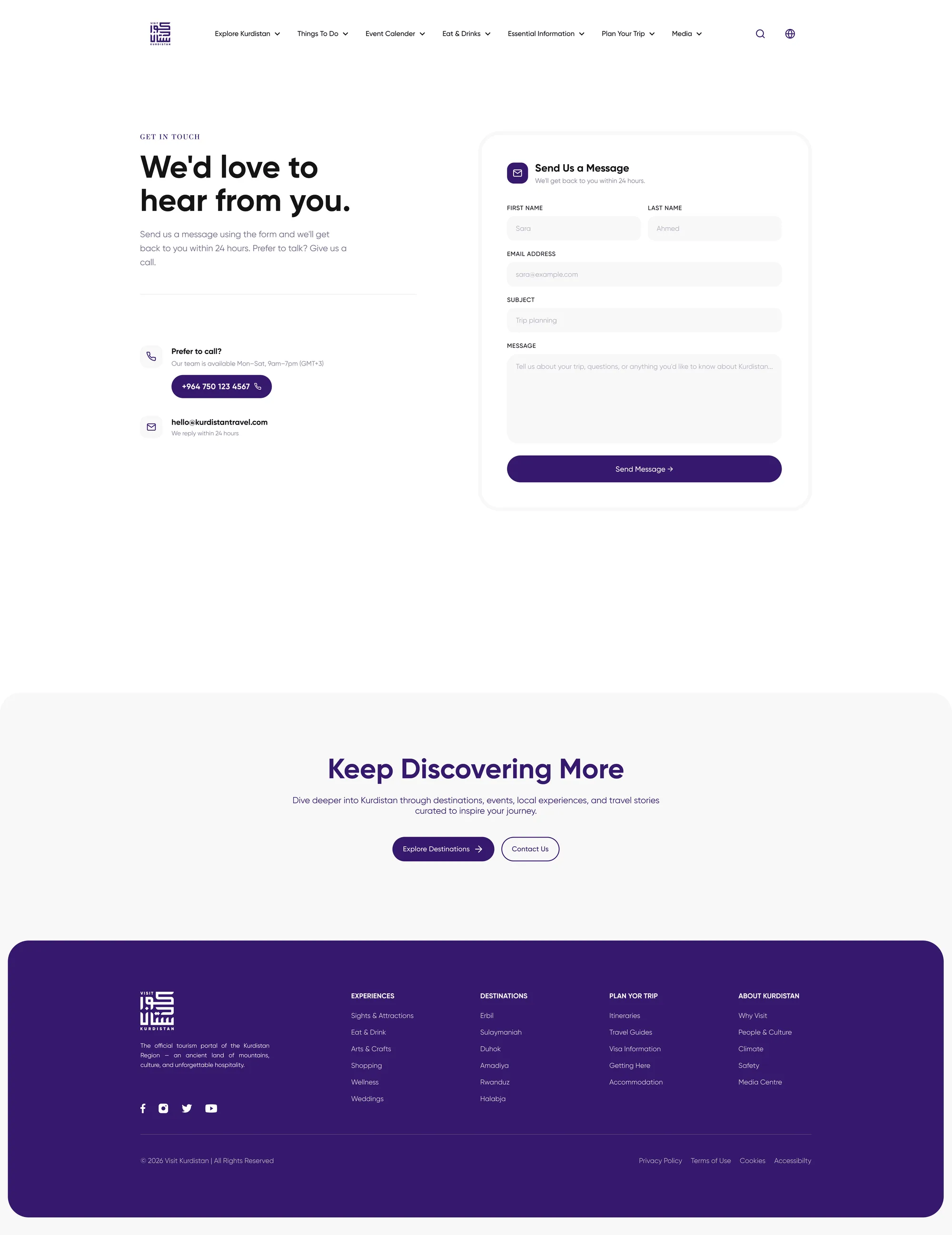
Contact Page
Let's connect
I designed the contact section to give visitors a clear way to reach the Visit Kurdistan team for questions, support, or collaboration.
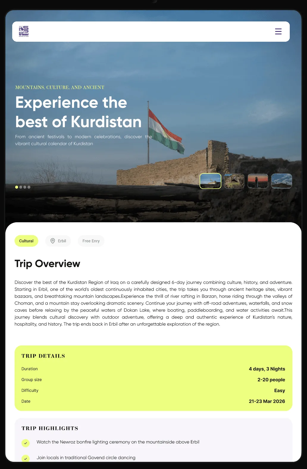
Mobile & Tablet
Smaller screens. Same thoughtful experience.
I adapted the layouts for mobile and tablet, keeping content clear, navigation simple, and key actions easy to reach. Each version carries the same visual identity while making the most of the available space.
01 — 07
Swipe or use the arrowsDrag or use arrows to navigate
Design Reflection
Looking back
I brought together local stories, travel information, and a touch of yellow to create a welcoming experience for exploring Kurdistan. Clear sections and simple navigation help visitors discover new places, get to know the culture, and find useful information to plan their trip.
Function first.Beauty always.