Mesopotamia Leadership Institute
I designed MLI’s website to bring information, programs, and sign-ups into one place. By moving registration online, the project helped people apply more easily and helped the MLI team process applications faster.
Role
UIUX Designer
Timeline
5 Weeks
Platform
Web . Responsive
Language
English, Kurdish, Arabic
Pattern System
A signature pattern born from the brand's core elements.
The pattern was crafted by deconstructing one of the brand's key visual elements — breaking it down into its essential geometric forms and repeating them at varying scales and rotations.

Color Palette
Institutional character, contemporary warmth
Deep navy anchors the palette in academic tradition, while airy highlights and warm peach accents soften its formality. Together, these shades create a visual identity that feels established yet approachable.
Deep Euphrates
Primary Color
- HEX
- #1f2a44
- RGB
- 31,42,68
Accent
Primary Color
- HEX
- #3a86ff
- RGB
- 58,134,255
Hawler Horizon
Primary Color
- HEX
- #dde5ed
- RGB
- 221,229,237
Pure White
Base Color
- HEX
- #ffffff
- RGB
- 255,255,255
Ancient Brick
Secondary Color
- HEX
- #653024
- RGB
- 101,48,36
Desert Bloom
Secondary Color
- HEX
- #ffb990
- RGB
- 255,185,144
Home Page
A simpler way to discover and apply
MLI had no unified digital presence — their programmes, events, testimonials, and editorial content lived in scattered places. The brief was to design a single, authoritative website that communicates seriousness, attracts applicants, and earns the trust of institutional stakeholders.

About MLI
Get to know MLI
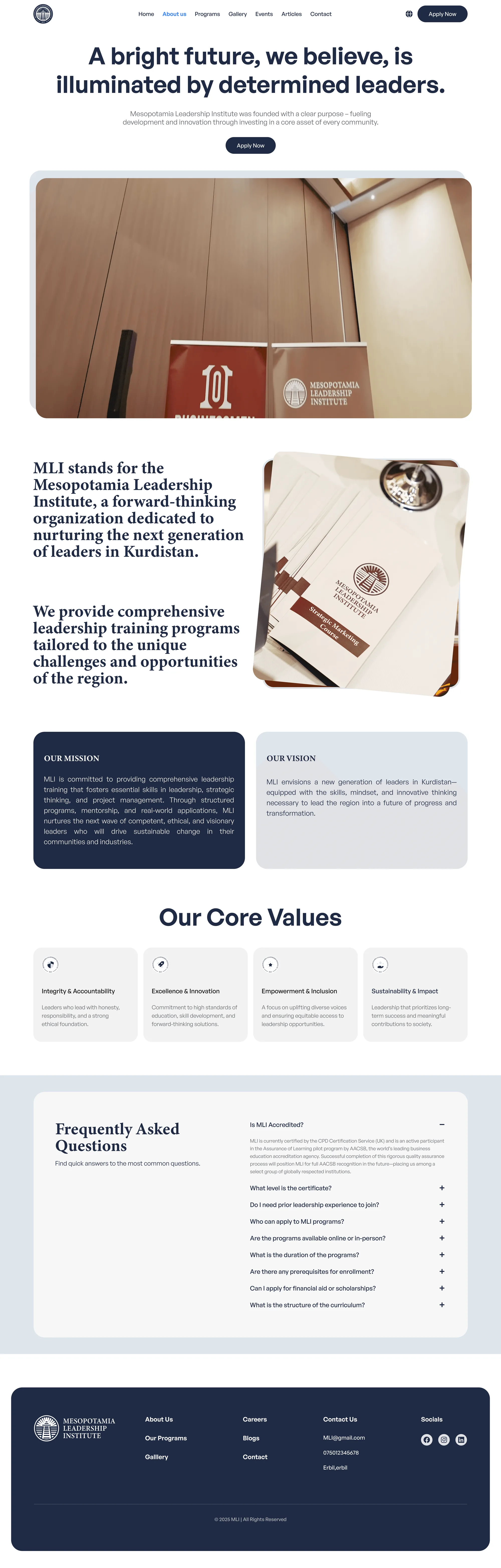
The About page introduces MLI and gives visitors context before they explore its offerings. I structured the content into readable sections to help people understand the organisation and feel more informed before applying.
Programs
Find the right program
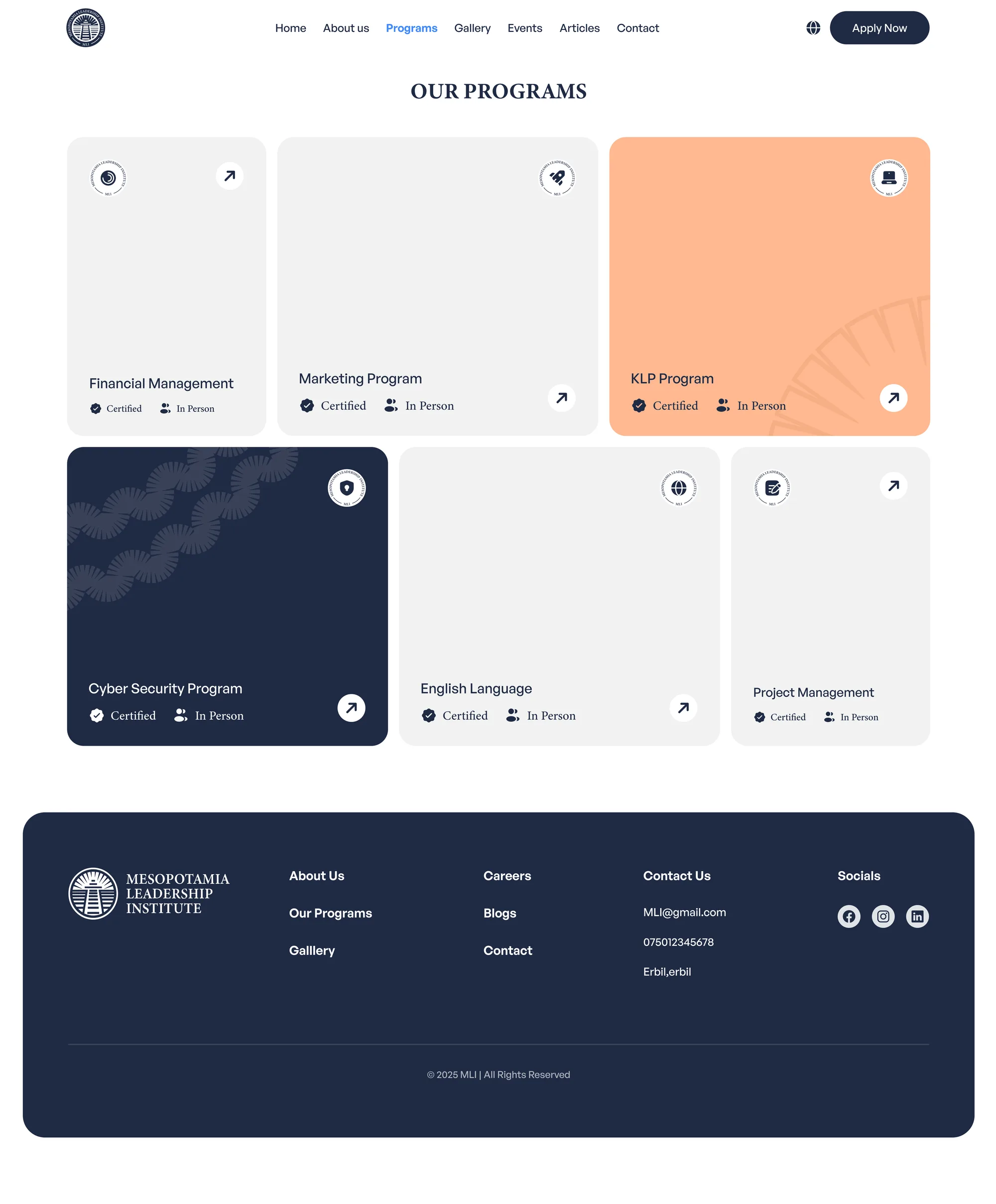
The Programs page brings MLI’s offerings together so visitors can explore their options before signing up. Clear organisation helps people find relevant information and move towards an application with a better understanding of their choice.
Online Applications
Less back and forth, faster applications
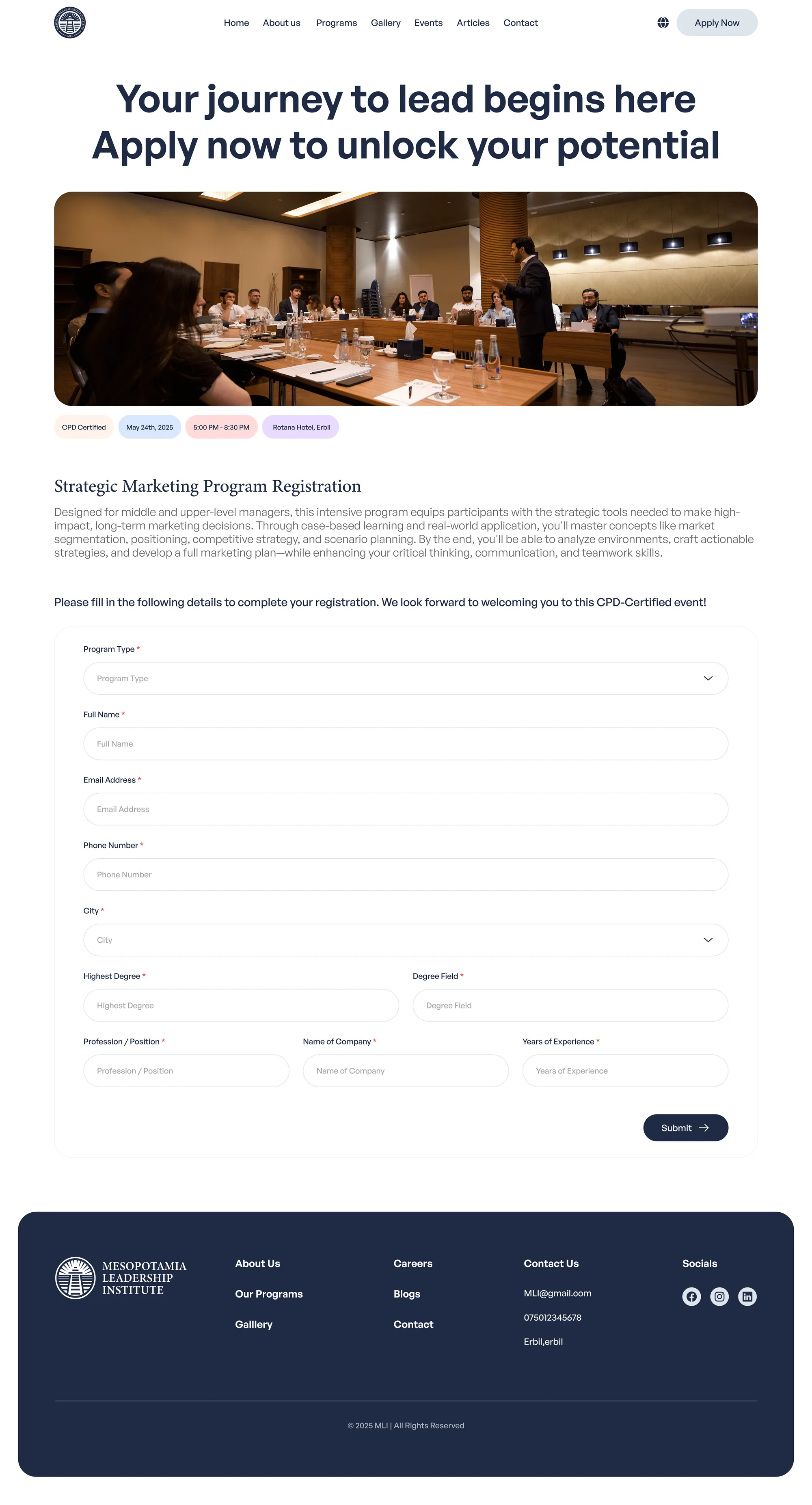
The Apply Now page is at the centre of the digital experience. Bringing sign-ups online gave applicants a direct way to submit their information and helped MLI collect the details needed in one consistent process, making applications easier to handle and faster to review.
Events
Discover what is happening at MLI
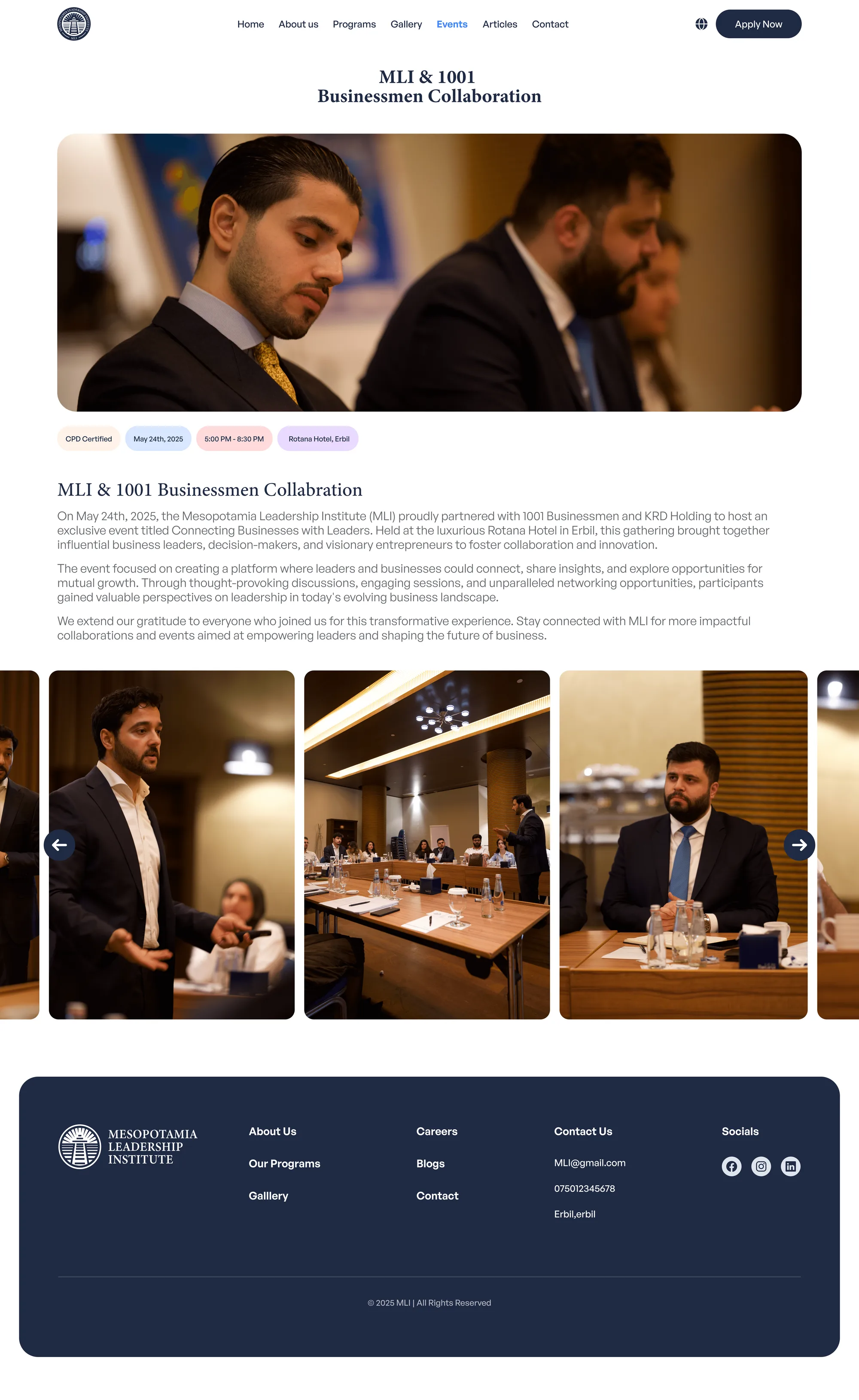
The event page gives each event a dedicated space for its information. I brought the details together to help visitors understand the event and decide whether they want to take part.
Articles
More to explore and learn
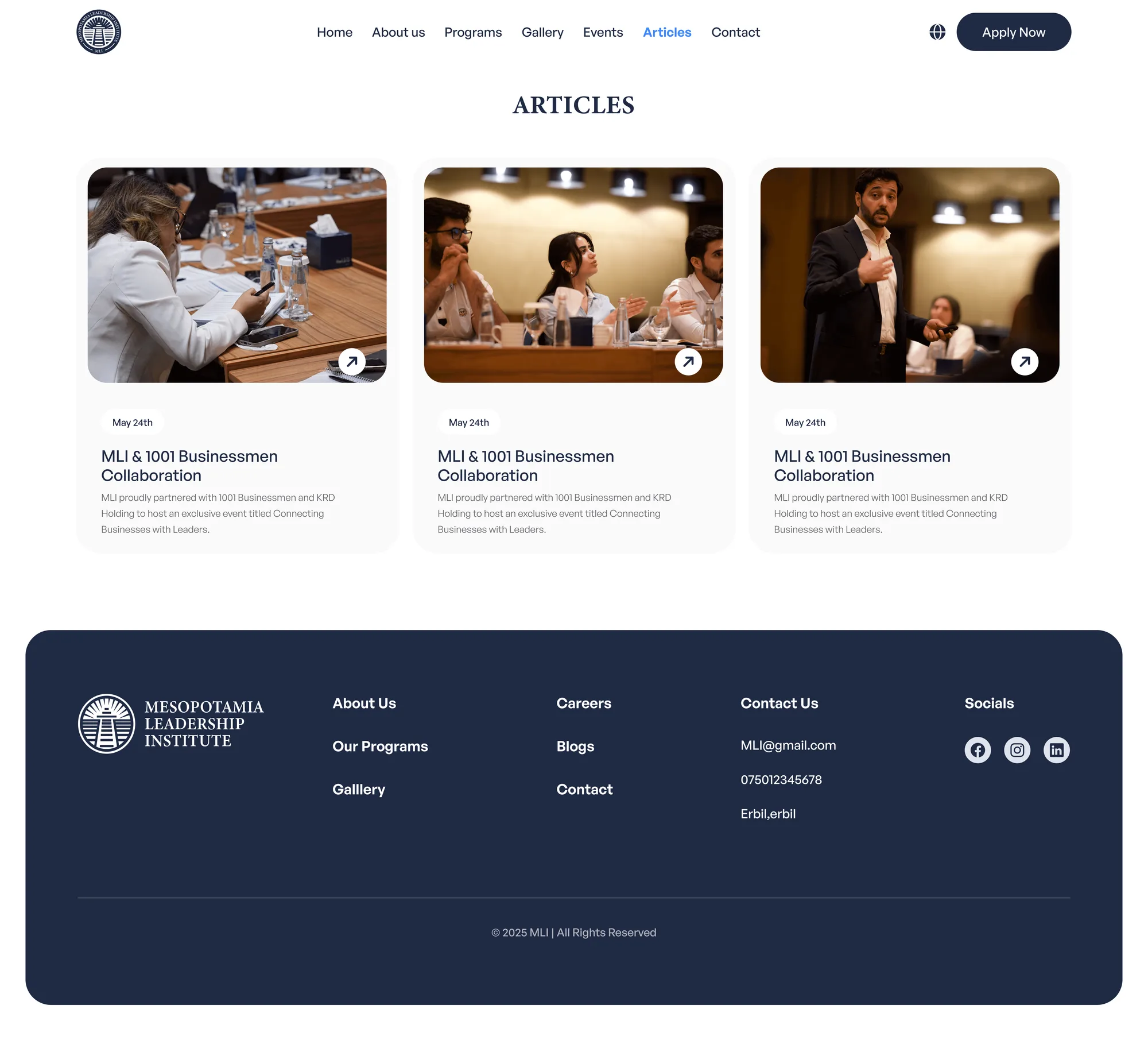
The Articles page gives MLI a space to share information beyond its programs. I focused on a readable layout that helps visitors browse topics, discover relevant content, and stay connected with the organisation.
Contact
An easy way to reach out
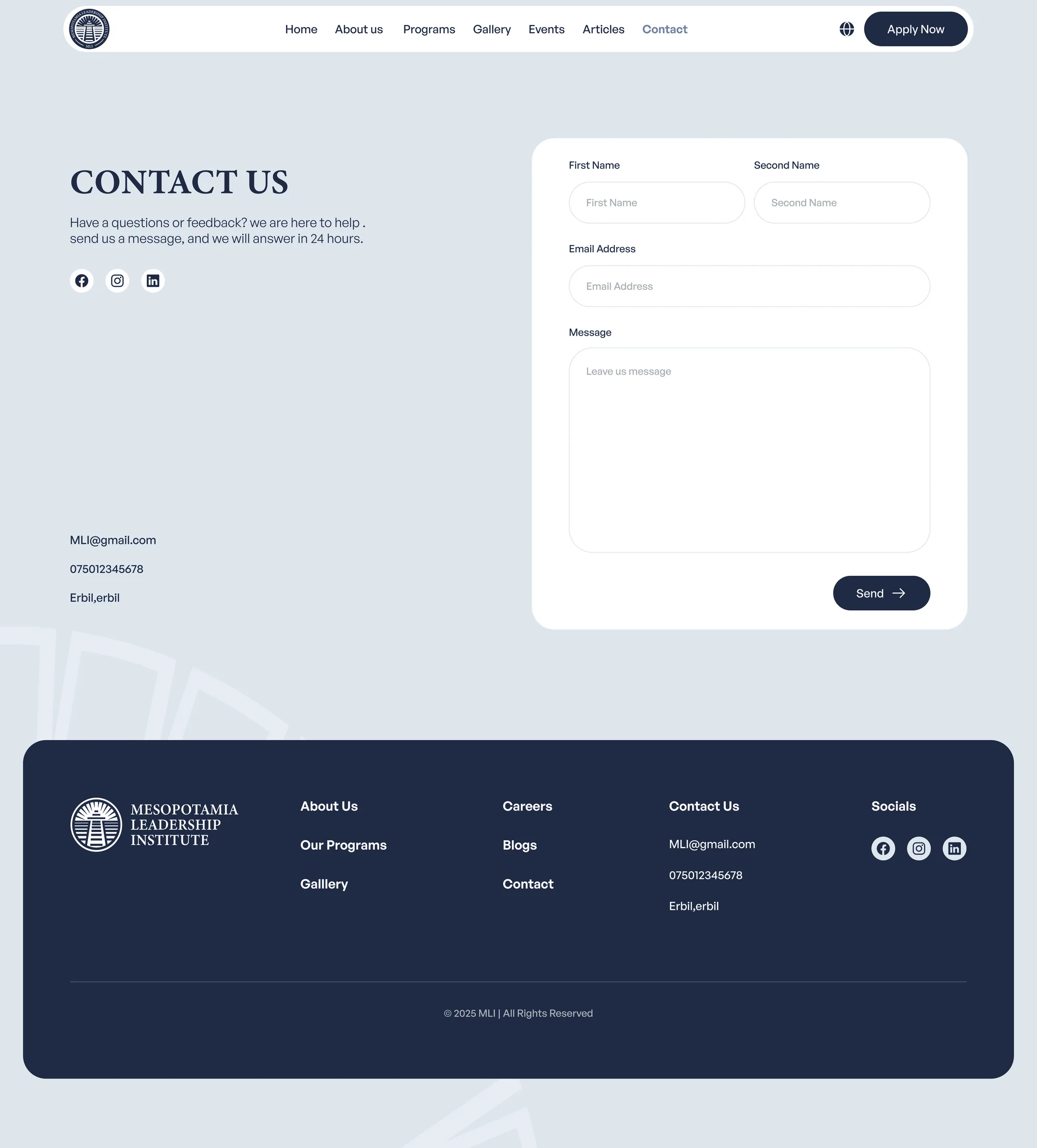
The Contact page supports visitors who need more information before taking the next step. Giving questions a clear destination helps people reach MLI when they need guidance about the organisation, its programs, or applying.
Mobile Experience
Designed for every screen.
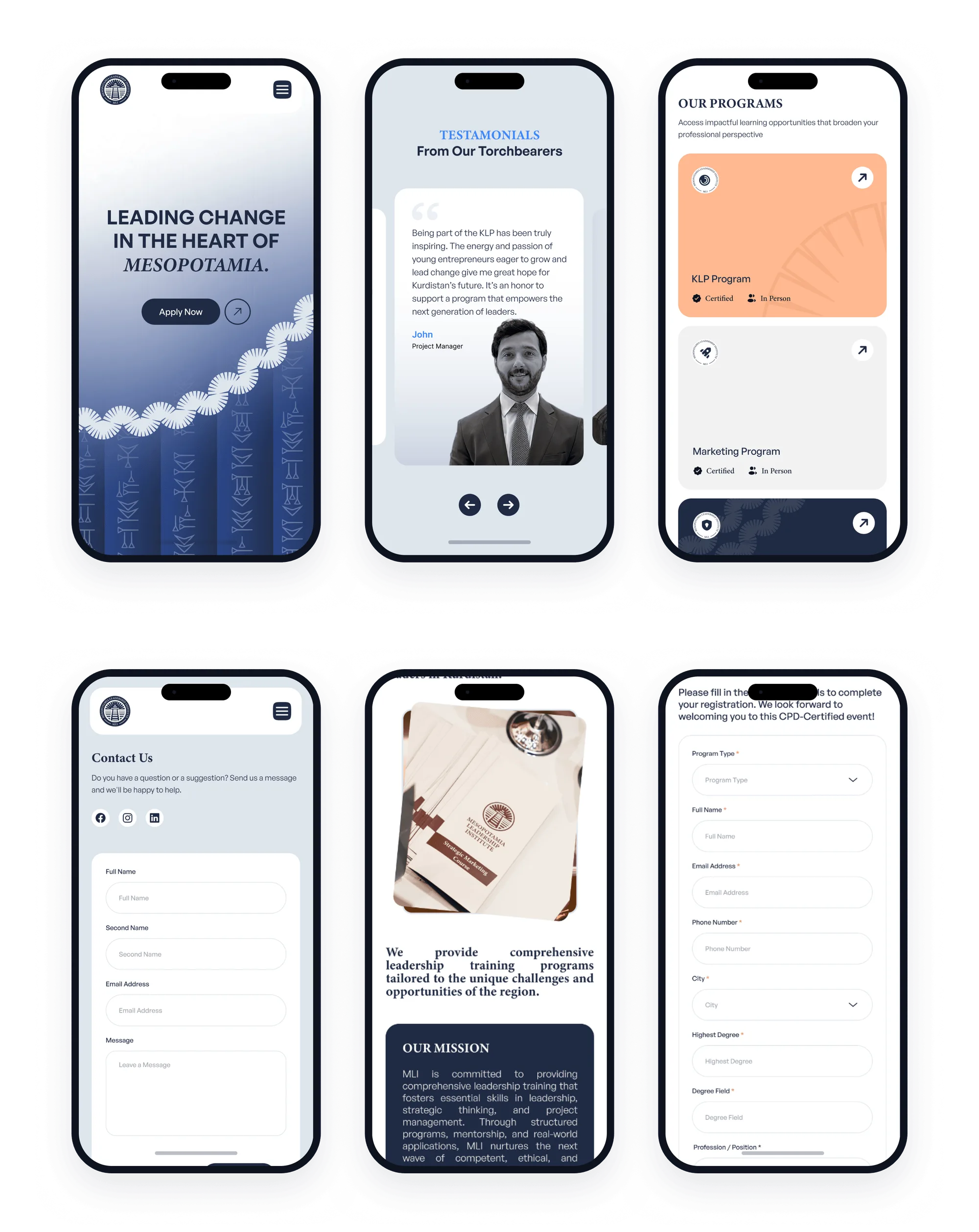
I adapted the experience for smaller screens, keeping information readable and the application journey easy to follow. Visitors can learn about MLI and complete their sign-up from their phones, with the same attention to clarity as the desktop experience.
Design Reflection
A faster process starts with clearer design
This project brought MLI’s information and sign-ups into a connected digital experience. The result made applying easier for visitors and helped the team process submissions faster, showing how clearer design can support everyday work.
Function first.Beauty always.