Making digital identity easier to understand
I designed a one-page website introducing the Unique Personal Number (UPN), bringing its purpose, benefits, and key information into one place. Through custom cards, icons, and illustrations, I turned technical information into a visual experience that feels approachable and easy to follow.
Color Palette
A calm approach to digital identity
I paired soft blues with snow white and midnight navy to create a calm, approachable feel. The palette keeps the cards, icons, and illustrations consistent across both light and dark themes.
Sky Blue
- HEX
- #8cc4ff
- RGB
- 140,196,255
Powder Blue
- HEX
- #c0ddff
- RGB
- 192,221,255
Snow White
- HEX
- #fbfbfb
- RGB
- 251,251,251
Midnight Navy
- HEX
- #1c2536
- RGB
- 28,37,54
Home Page
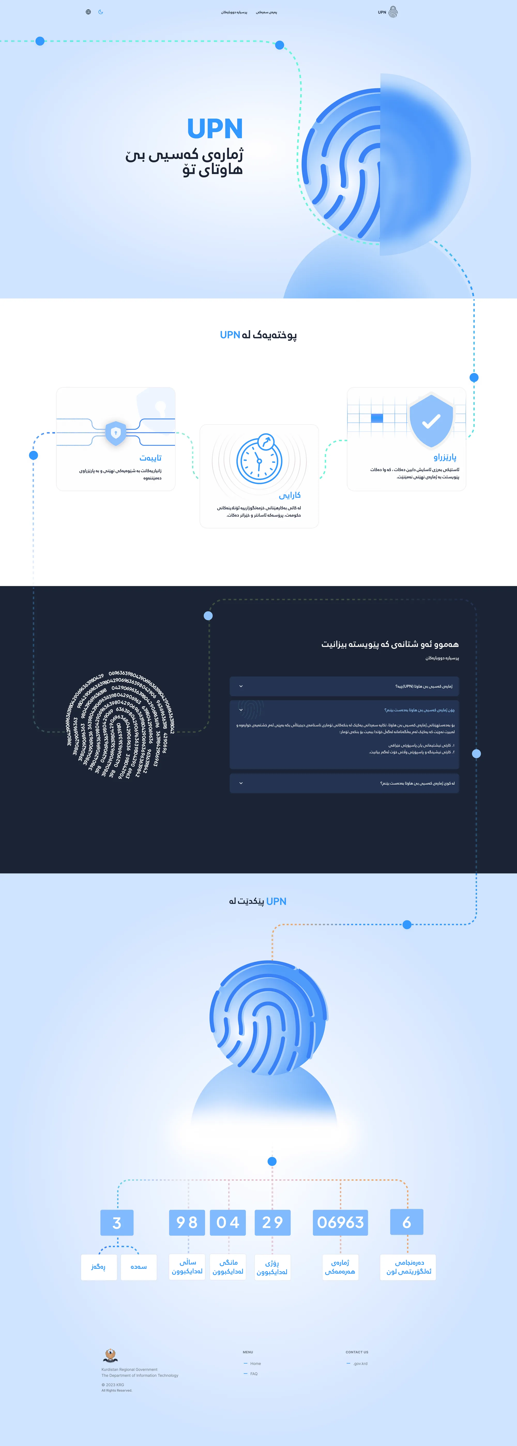
A personal identity, visually expressed
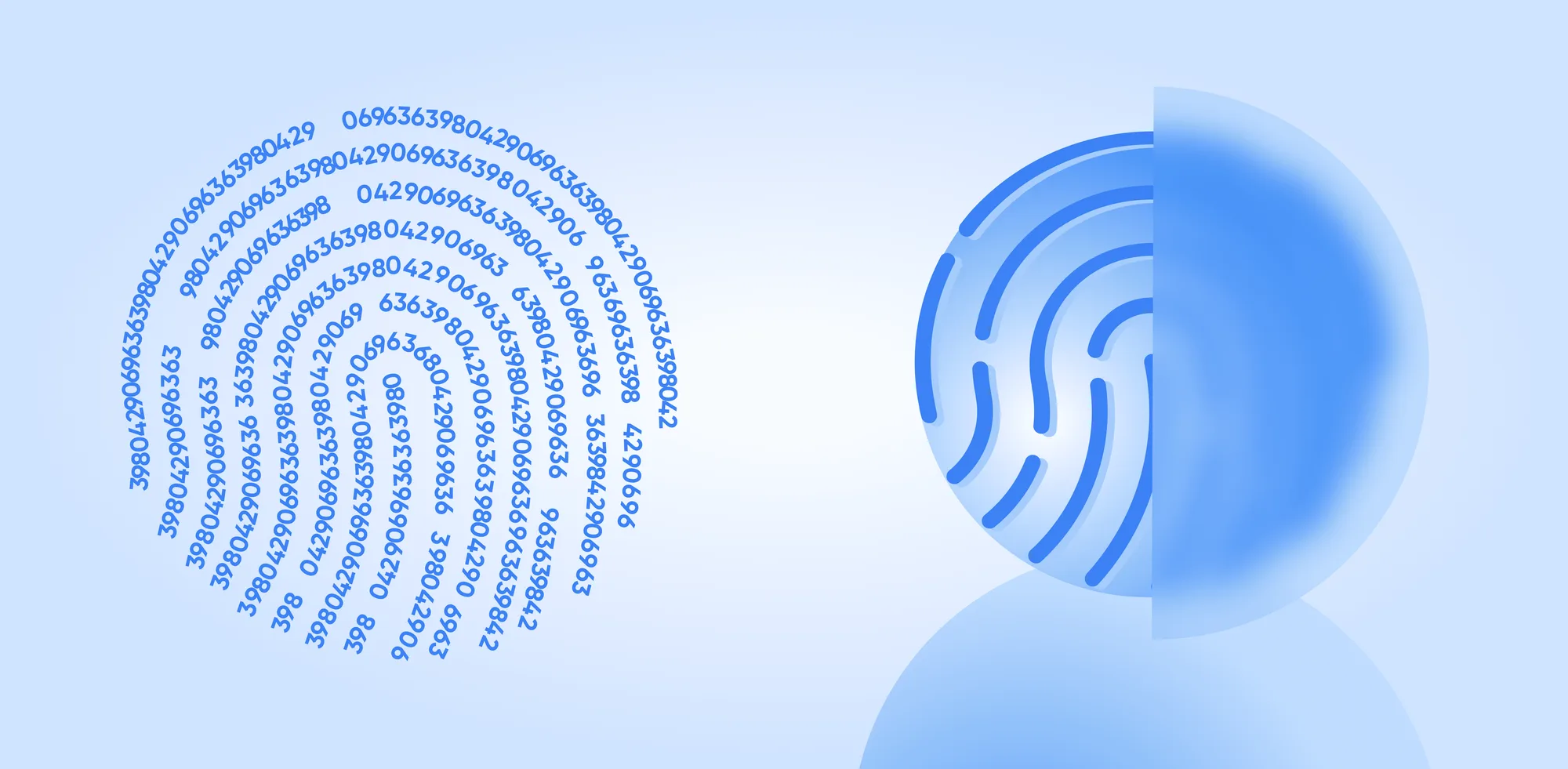
I used a fingerprint as the central visual to represent the uniqueness of each person’s identity. Blue tones and a dotted line connect the sections, giving the page a consistent visual story from the introduction to the number breakdown.
Custom Cards & Icons
Small Details That Explain Big Ideas
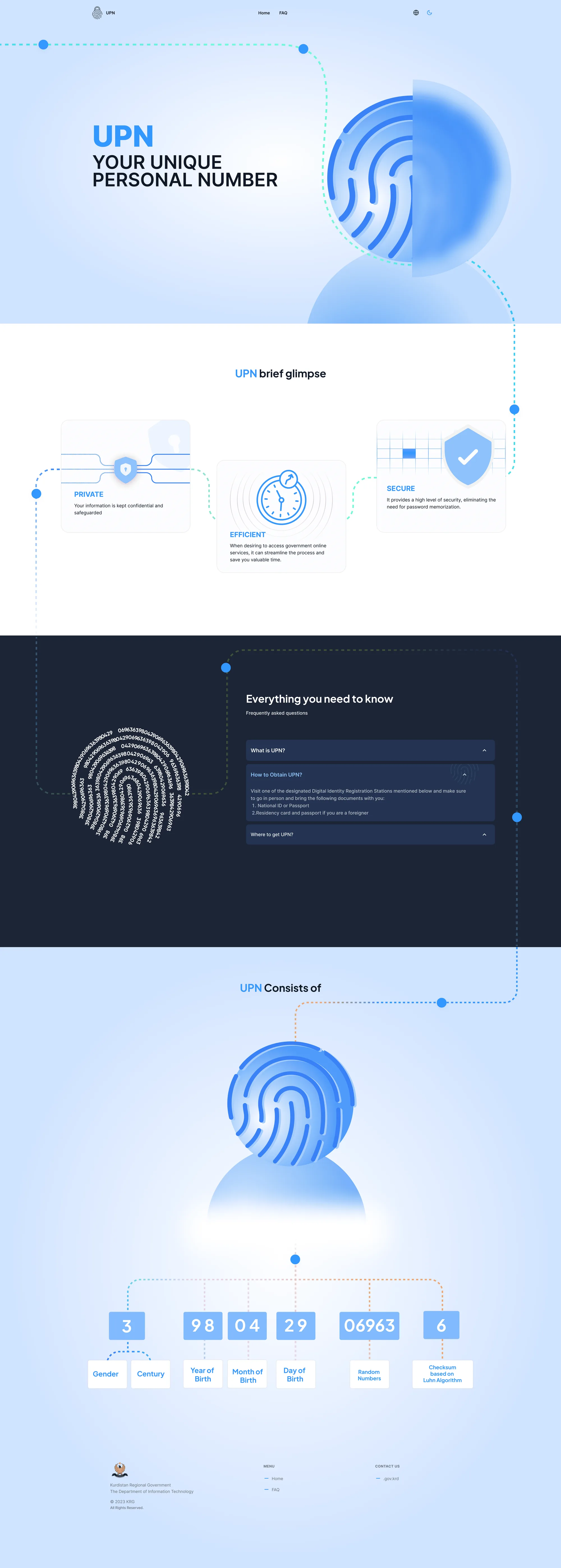
I designed each card and icon to communicate UPN’s core benefits: privacy, efficiency, and security. Pairing familiar symbols with short explanations helps visitors scan the information and understand the main ideas at a glance.
Custom illustrations
Bringing the idea to life
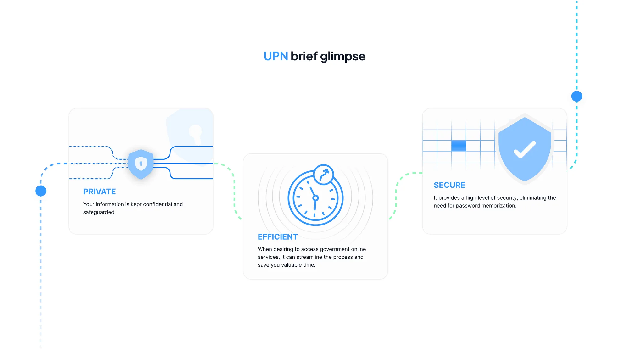
I created custom illustrations to explain UPN visually, using fingerprints, icons, and connected elements to make digital identity feel more familiar and easier to understand.
Frequently Asked Questions
Clear Answers In One Place
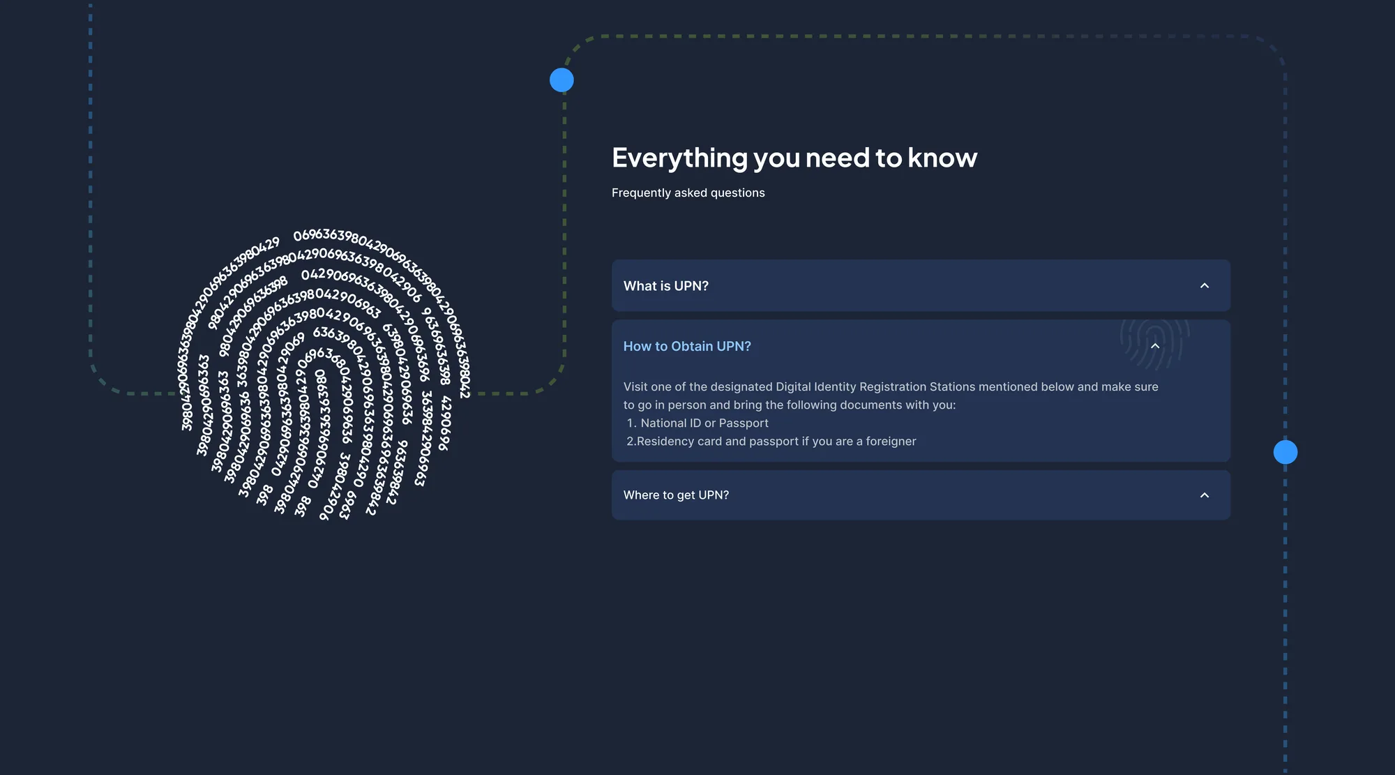
I organised common questions into a compact accordion, covering what UPN is, how to obtain it, and where to get it. Visitors can open the information they need while keeping the page simple to browse.
Information Design
Breaking Down The Number
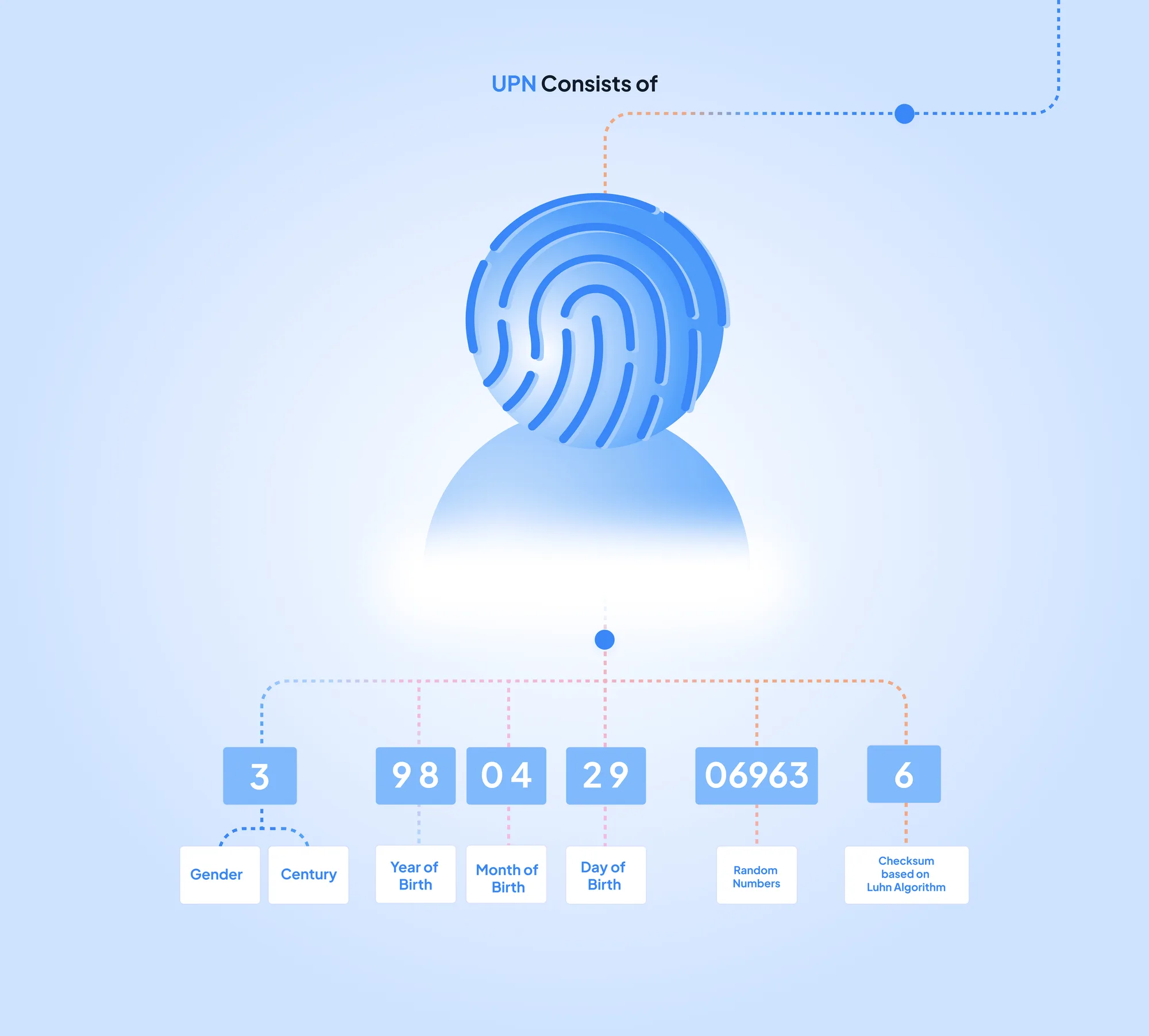
To explain the structure of a UPN, I created a visual breakdown that connects each group of digits to its meaning. Colour-coded lines and individual labels turn a long number into smaller, easier-to-understand parts.
Light & Dark Themes
One Identity, Two Appearances
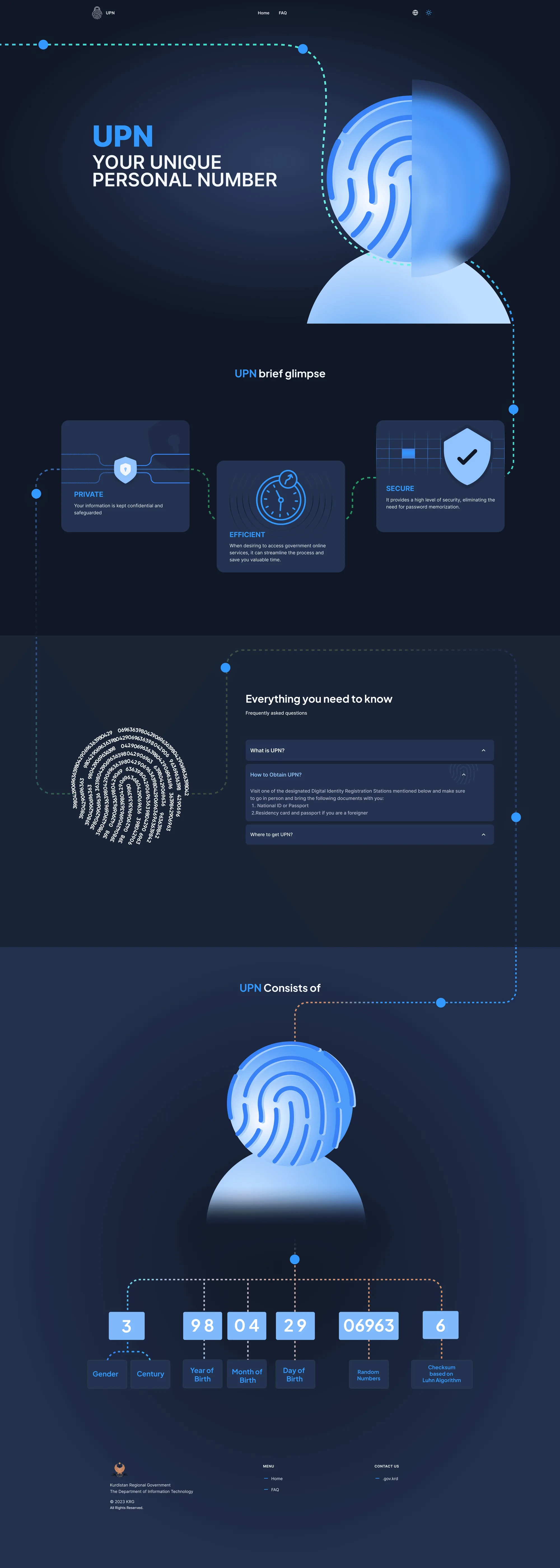
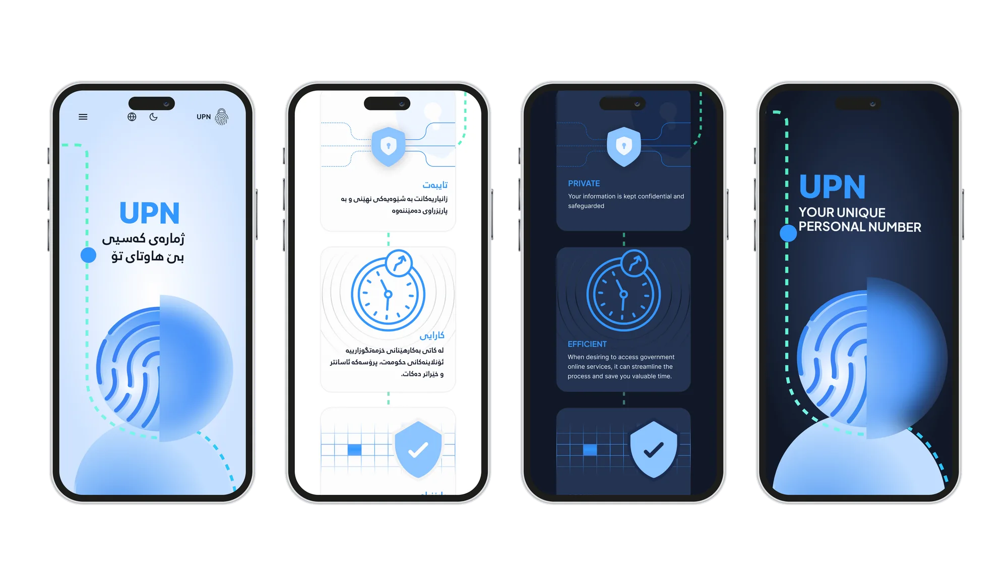
I designed light and dark versions, adapting the backgrounds, cards, and illustrations while keeping the same visual identity. The blue accents and fingerprint imagery carry through both themes for a consistent experience.
Multilingual design
Making UPN feel familiar
I designed the page to support Kurdish alongside English, adapting the layout for right-to-left reading. Consistent visuals connect each version, helping people explore UPN in a language they feel comfortable with.
Mobile Experience
Clear information on every screen
I adapted the layout, cards, and illustrations for smaller screens, keeping the information easy to read and follow while preserving the page’s visual identity.
Design Reflection
Bringing Clarity Through Visual Design
This project brought together information design and custom visuals within a single page. Every card, icon, and connecting line was designed to help explain UPN and make an unfamiliar concept feel more understandable.
Function first.Beauty always.